Website Design & Development
What Community Banks Need From a Website in 2026
May 8, 2026 · 7 min read · MPC Studios
Community banking is having a strange year. The Federal Reserve's 2026 Survey of Consumer Finances reported that mobile-channel banking now accounts for more than 70% of all primary-account interactions among U.S. consumers, up from 58% just three years earlier. At the same time, community banks are seeing some of the strongest deposit growth in a decade as customers rebalance away from large-institution savings products. The bank that wins this moment is the one whose digital experience matches the trust the brand earned at the branch.
We have been building websites for community banks across Texas and the Southeast for years, and the brief in 2026 is meaningfully different from what it was in 2022. Below is the version of the requirements we walk every banking client through before a project kicks off. It is the same conversation whether the bank has eight branches or eighty.
Mobile is the canvas, not a courtesy
The 70% mobile-primary number above understates the issue for community banks specifically, because the younger customer cohort the bank is trying to recruit is closer to 90% mobile-primary. A website designed for a desktop browser and then adapted for mobile reads, to that audience, like a bank designed for somebody else.
A page that works on a phone almost always works on a desktop. The reverse is not true, and most community-bank sites in the market today have very clearly been designed the other direction.
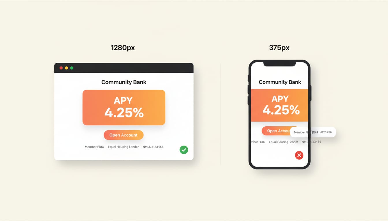
The right way to design a banking site in 2026 is to design every page mobile-first. The rates table, the loan application, the branch finder, the appointment scheduler, the disclosures, every one of them.
Mobile-first also has compliance implications most banks underestimate. The FDIC's Equal Housing Lender mark, the NMLS identifier, the Member FDIC disclosure: all of these have placement and legibility requirements that are easy to satisfy on a 1280-pixel hero and easy to fail on a 375-pixel phone. The right time to handle that is during design, not in a remediation pass after launch.
Rates and disclosures need to be a system, not a page
Every community bank's website has a rates page. Almost none of them treat rates as a system. The rates change, the page goes stale, somebody emails marketing, the page gets updated three weeks later, and in the interval the bank has been quoting incorrect rates to every search visitor who landed on the page. We have audited bank sites in 2026 that were displaying APYs from late 2024.
The fix is treating rates as structured data with a versioned source of truth, not as marketing copy. The bank's treasury or product team updates a single record. The website renders the current value automatically. The historic versions stay archived for audit. When the examiner asks "what rate was published on March 14," the answer is exact and timestamped.
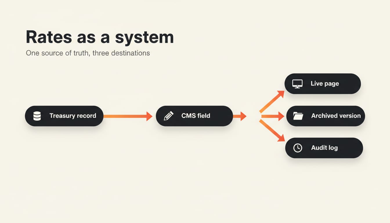
The same pattern applies to disclosures. A community bank in 2026 typically has dozens of regulatory disclosures that need to appear on specific pages, in specific places, with specific legibility. Treating each one as hand-coded HTML inside the page template is how the rates page ends up displaying the 2024 fee schedule. Treating them as managed content with assigned owners and refresh cadences is how the bank stays out of an enforcement letter.
Our banking industry page covers the broader regulatory architecture we apply to community-bank sites.
Search needs to bring real customers, not directory traffic
Most community banks rank well on their own name. They almost never rank for the bottom-of-funnel terms that bring new customers. A search like "best savings account rate near me" or "small business loan in Brownsville" should be part of the bank's organic search footprint, and on most community-bank sites today it is not.
The fix is structural. Each branch needs to be a proper local SEO entity with its own page, schema markup, NAP consistency across directories, and Google Business Profile alignment. Each product line needs a landing page that targets the actual buyer intent rather than the bank's internal product taxonomy. Each market the bank serves needs at least one piece of content that demonstrates community involvement in that market, because Google's local search ranking algorithm is now meaningfully influenced by topical relevance signals, not just by proximity and reviews.
A community bank that gets this right captures search traffic the megabanks cannot. The megabanks rank for "savings account" generically and miss the geographic intent. A community bank with a tight local-SEO posture wins "savings account in Mercedes Texas" without competition, and the customer who clicks through is precisely the customer the bank wanted in the first place.
The megabanks rank for "savings account" generically and miss the geographic intent. A community bank with a tight local-SEO posture wins the customer the megabank never knew was searching.
Application flows need to be honest about the handoff
The other large gap on community-bank sites in 2026 is the application experience. The customer fills out a long form, hits submit, and lands on a generic thank-you page. Two days later somebody from the bank calls them back. By that point the customer has often opened an account with a fintech that responded the same hour.
The right design treats the application as the start of a conversation, not the end of a form. The customer who submits a small-business loan inquiry should see an immediate, accurate response that includes who at the bank will be handling their inquiry, what the next step looks like, and a realistic time window. That experience does not require a chatbot or an AI agent (though both can help). It requires honest design of the post-submit screen and a real, monitored alerting system on the bank's side.
For applications that genuinely require document collection (mortgage and small business loans in particular), the upload step needs to be friendlier than every customer's last experience with a banking PDF. Mobile upload, drag-and-drop on desktop, a clear list of what is being collected and why, a saved-progress mechanism. A bank that makes its application experience meaningfully better than the local competitors' is a bank that closes more loans without spending more on advertising.
The team page is the brand promise
The single biggest competitive advantage a community bank has over a megabank is the human relationship. Half the community-bank websites in the market today are still using stock photography of generic professionals in business suits. The other half have an outdated team page that has not been updated since the last regional president retired.
A modern team page does work. It introduces every customer-facing officer, shows them as real people, explains what they specialize in, and gives the visitor a way to ask for them by name. For prospective customers comparing the community bank to the megabank's call-center experience, the team page is the part of the website that closes the deal. It deserves photography that matches the rest of the brand and copy that reads like the actual people, not like the marketing team imagining them.
What we tell clients to expect
A community-bank website that gets all of this right is meaningful work, and the build typically runs four to six months from kickoff to launch. The work that pays off compounds for a decade afterward. The bank that ships this in 2026 will be the bank whose deposits are growing in 2030, because the digital experience and the branch experience will finally tell the same story.
If your bank is starting to think about what comes next, the contact page is the right place to begin. We work with community-bank teams to scope this work in a way that respects the compliance constraints, the team's existing systems, and the long arc of the bank's brand.
Planning a website project for your bank? Start a conversation. We will share our community-banking design audit with you in the first call.
Let's work together
Ready to take your
business further?
Tell us about your project and let's create something extraordinary together.