Website Design & Development
What Small Bank Website Launches in 2026 Tell Us About Where Community Banking Is Headed
May 22, 2026 · 8 min read · MPC Studios
A community bank's website used to be a brochure with a login button. It's now the part of the bank that most customers actually use. Branch traffic keeps falling, mobile-first behavior keeps climbing, and the gap between the banks that have figured this out and the ones that haven't is starting to show up in deposit growth.
We've been watching small bank website launches and redesigns roll out across the country this year. The patterns are clear enough that they're worth writing down. If you run marketing or strategy at a community bank with under $5 billion in assets, the moves below are the ones your peers are making.
The pressure driving all of this
Customer expectations have completely reset. People who use Chime or Cash App on Saturday expect their community bank's website to feel similar on Monday. According to Qrolic Technologies' February 2026 analysis of bank redesigns, the standards for what counts as a "good" user experience have shifted from "functional" to something much closer to what fintechs deliver, and a banking platform that feels like a relic of the mid-2010s is losing real deposits, loan applications, and trust.
At the same time, there's a wave of new community banks entering the market for the first time in years. PCBB reported in March 2026 that 31 new banking charter applications were filed in 2025, and 12 were for full commercial bank charters from traditional de novo organizers building around branch networks or hybrid community banking models. These new entrants are launching with modern websites by default, which puts pressure on incumbent community banks that haven't touched their sites in five or six years.
The result is a lot of small bank website activity in 2026, with some clear themes about what good looks like now.
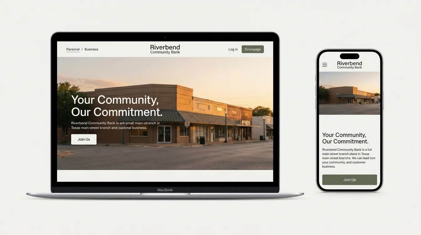
Trend 1: The Personal/Business split is becoming the default information architecture
The biggest structural change we're seeing is the move away from sprawling top-down menus toward two clean entry points: Personal and Business.
A redesign Paragon Digital Marketing completed for Savings Bank of Walpole, a 150-year-old community bank, shows the pattern in action. The team reorganized the entire site into two clear silos, with each one acting as a hub tailored to user goals, regional photography, and icon-driven navigation. The numbers backed up the structural choice. Key conversions increased by 55%, support inquiries dropped by 29%, and 67% more users started opening accounts online.
The logic is straightforward. A retired customer checking on CD rates and a small contractor looking for a working capital line have almost nothing in common other than the bank they walk into. Forcing both audiences through the same navigation creates friction for everyone. Splitting them at the front door lets you tune the language, imagery, and featured products to each group from the moment they land.
For a small bank, this also solves a real internal problem. It gives marketing and product teams a clear surface to update without renegotiating the whole homepage every time a new commercial product launches. The same information architecture discipline we walk through with every banking client starts at this split and propagates down through rates, disclosures, and applications.
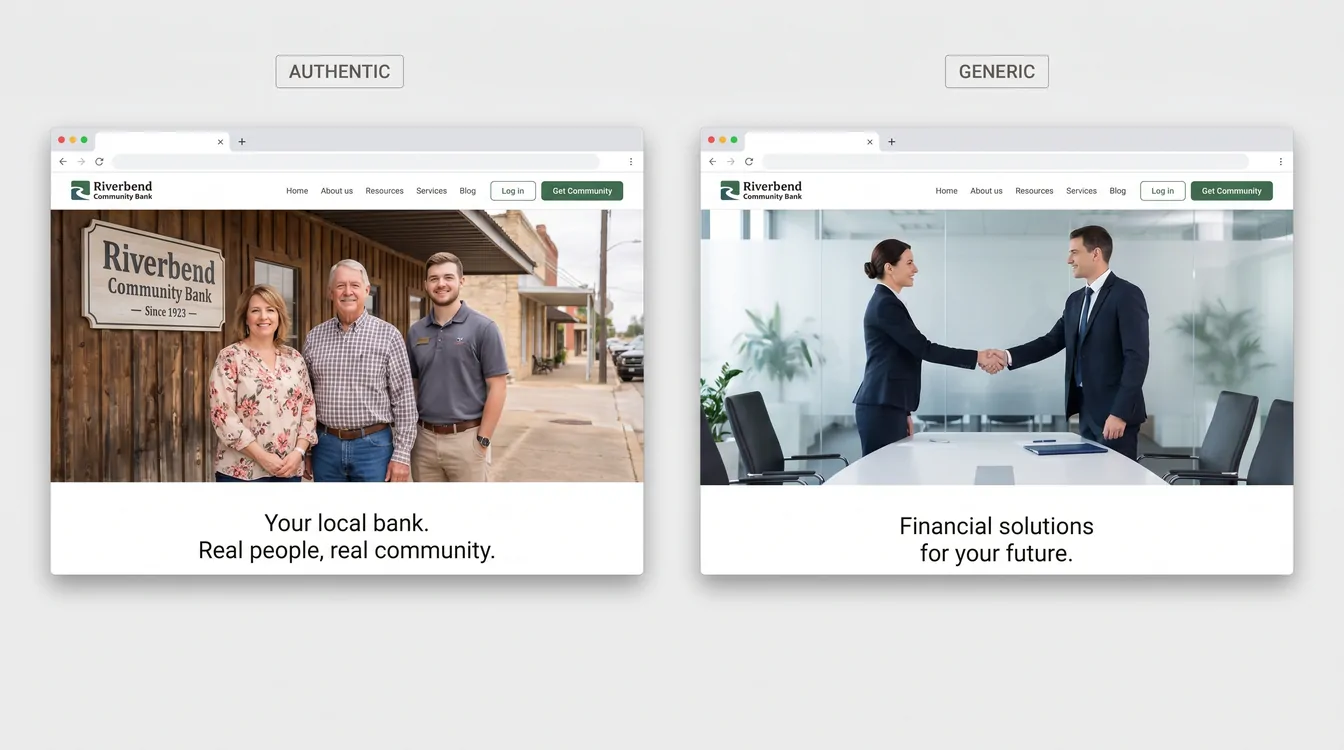
Trend 2: Local imagery is replacing generic stock photography
Five years ago, a community bank website was visually indistinguishable from a regional insurance broker's website, because both leaned on the same library of handshake photos, smiling-people-around-a-laptop shots, and golden-hour exteriors.
That's changing fast. Community Resource Bank's redesign in the Twin Cities is a useful example of where this is heading. The team coordinated branded photoshoots with local partners and revised the brand messaging strategy before redesigning the bank's visual identity to align with it. Paragon's work on Savings Bank of Walpole did something similar, weaving local imagery, updated iconography, and a refreshed color palette that reflected the bank's 150-year legacy in their region.
This shift makes sense when you remember what a community bank actually sells. Rates aren't the pitch. The big banks and the online challengers will usually beat a community bank on rates. The pitch is that someone in your town, who knows your contractor and your accountant, is the person making decisions about your loan. The website has to look like that's true, and stock photos of generic professionals quietly undermine the entire story.
Real photography of real branches, real staff, and real customers (with permission) is one of the highest-ROI design changes a small bank can make. It signals authenticity in a way no amount of brand color refinement can match.
Trend 3: Interactive product-discovery tools are showing up at the top of the funnel
A handful of banks are starting to build tools that help visitors figure out which account or product they need before talking to anyone. Raborn Media's work for Community Bank is one of the clearest examples. The team introduced an Account Match Tool that helps users discover the right products based on their goals, paired with an Office Locator and a Community Hub featuring fresh local stories each month.
Most community bank websites still list their checking accounts in a comparison table and trust the visitor to figure out which one fits. That worked when customers walked into a branch and asked a teller. It stops working when the customer is on their phone at 9 p.m. comparing your bank to three others. A short interactive questionnaire that ends with "based on what you told us, you want the Premier Checking" converts dramatically better than a pricing grid.
The same pattern is showing up in calculators for mortgages, retirement, and business loan affordability that go beyond the embedded widgets most bank vendors have offered for years. The better implementations capture an email at the end, which turns the website into a real lead generation surface rather than a static reference document. These are the kind of custom interactive tools that take a website from a static reference to a working part of the sales funnel.
Trend 4: Vertical and niche positioning is reshaping the homepage
The most interesting strategic story in community banking right now is about who small banks are deciding to serve. That choice is starting to land on the homepage.
The Financial Brand's November 2025 analysis described how ROGER Bank redesigned its web presence with military-focused imagery, terminology, and features that built trust with their target demographic. Alabama's 22nd State Bank is taking a similar approach, debuting a national Always.bank digital platform focused entirely on small-business banking, with the stated vision of building an advisor-led bank that combines modern digital banking with the trust and guidance of a true financial partner. Generations Community Bank, which opened in Indianapolis in April 2026 as Indiana's first Minority Depository Institution, is built around serving underserved and underrepresented communities through customized financial products and education.
The implication for small bank websites is significant. The current strategy is to pick an audience (small businesses, farmers, healthcare professionals, a specific ethnic community, military families) and design the entire digital experience around them. When you visit a vertical-focused community bank website, the language, the featured products, and the imagery all line up around one audience. That's a hard thing for the big banks to copy, because their platforms have to serve everyone at once.
Trend 5: Speed and accessibility are finally being treated as requirements
This one is less glamorous, but it might be the most important.
Coastal Community Bank's redesign focused on an intuitive user flow and a modern, secure design that boosted average engagement time by 83.3% and increased page views per session by 25%. The work wasn't about a flashy hero animation. It was about making the site actually work on the devices customers use, at the speeds they expect.
The reason this is finally landing is that the cost of slow, inaccessible websites has become measurable. Google penalizes slow sites in search results. Customers bounce from sites that don't load in three seconds. ADA accessibility lawsuits against banks have become common enough that compliance teams are pushing back on legacy designs that fail WCAG, the Web Content Accessibility Guidelines that set standards for color contrast, keyboard navigation, and screen reader compatibility.
For small banks, the good news is that fast and accessible doesn't require an exotic tech stack. It mostly requires a development team that treats performance seriously from the start, instead of treating it as a post-launch optimization.
Trend 6: The .bank domain is slowly becoming the standard
A smaller but meaningful pattern: more community banks are moving from .com to .bank when they redesign. Community Resource Bank made the switch as part of their redesign because the .bank domain has stricter verification, mandatory multi-factor authentication for registrants, and DNSSEC requirements that make domain spoofing much harder.
For a customer who's been targeted by a phishing email pretending to be from their bank, the .bank ending is a real trust signal. It quietly adds up across millions of interactions over the life of a website.
What this means if you're running a community bank in 2026
The community banks launching new websites this year are responding to a real shift in customer behavior. Most of their moves are defensive, designed to keep customers from drifting to fintech challengers and digital-only banks that have been refining their interfaces for a decade. The strongest launches are also using the website to actively differentiate the bank's positioning around a vertical, an audience, or a community story that the big banks can't credibly tell.
The institutions getting this right share a few common traits. They chose an information architecture that matches how customers think about their finances, rather than how the bank's org chart is structured. They invested in real photography and real stories. They built at least one or two interactive tools that help visitors self-qualify before reaching out. And they treated accessibility and performance as starting requirements.
If your bank's website was last redesigned in 2019 or 2020, the gap between what it does and what customers now expect is wider than it looks from inside the building. As Ritner Digital noted in February 2026, playing it safe online has stopped being safe, because an outdated website creates risk in quieter, harder-to-measure ways. The banks moving on this in 2026 aren't doing it because someone showed them a pretty mockup. They're doing it because the cost of waiting another year keeps getting higher.
Designing or rebuilding a community bank website? Let's talk.
Let's work together
Ready to take your
business further?
Tell us about your project and let's create something extraordinary together.